-
실전 예제 - 마케팅 데이터 분석 04 (Revenue - 02)빅데이터/Data-Analysis 2022. 2. 24. 15:58
패스트캠퍼스 '직장인을 위한 파이썬 데이터분석 올인원 패키치 Online' 참조
- 지금까지 K군집으로 고객세그먼트를 나누어 보았다.
- 또 다른 방법의 하나로 '실루엣'이라는 계수가 있다.
- 실루엣 계수를 구하는 방법은 각 샘플의 클러스터(군집) 내부 거리의 평균 (a)와 인접 클러스터와의 거리 평균(b)를 사용하여 계산. 즉 (b-1) / max(a,b) 로 계산
- 가장 좋은 값은 1, 최악은 -1로 나옴. 0 근처의 값은 클러스터가 오버랩이 되었다는 의미이며 음수값은 샘플이 잘못된 클러스터에 배정이 되었다거나 다른 클러스터가 더 유사한 군집이라는 의미
- 실무에서는 도메인에 따라서 스코어와 상관없이 적절한 K가 있을 수 도 있음
01 실루엣 계수 보기
from sklearn.metrics import silhouette_samples, silhouette_score

# 클러스터의 갯수 리스트를 만들어줍니다.
range_n_clusters = [2, 3, 4, 5, 6, 7, 8]

# 사용할 컬럼 값을 지정해줍니다.
X = df[['Age', 'Annual Income (k$)', 'Spending Score (1-100)']].values


for n_clusters in range_n_clusters:
    # 1 X 2 의 서브플롯을 만듭니다.
    fig, (ax1, ax2) = plt.subplots(1, 2)
    fig.set_size_inches(18, 7)

    # 첫 번째 서브플롯은 실루엣 플롯입니다.
    # silhouette coefficient는 -1에서 1 사이의 값을 가집니다.
    # 시각화에서는 -1 값이 잘 나오지 않음
    # -0.1에서 1사이로 지정해줍니다.
    ax1.set_xlim([-0.1, 1])

    # clusterer를 n_clusters 값으로 초기화 해줍니다.
    # 재현성을 위해 random seed를 10으로 지정 합니다.
    clusterer = KMeans(n_clusters=n_clusters, random_state=10)
    cluster_labels = clusterer.fit_predict(X)

    # silhouette_score는 모든 샘플에 대한 평균값을 제공합니다.
    # 실루엣 스코어는 형성된 군집에 대해 밀도(density)와 분리(seperation)에 대해 견해를 제공합니다.
    silhouette_avg = silhouette_score(X, cluster_labels)
    print("For n_clusters =", n_clusters,
          "The average silhouette_score is :", silhouette_avg)

    # 각 샘플에 대한 실루엣 스코어를 계산합니다.
    sample_silhouette_values = silhouette_samples(X, cluster_labels)

    y_lower = 10
    for i in range(n_clusters):
        # 클러스터 i에 속한 샘플들의 실루엣 스코어를 취합하여 정렬합니다.
        ith_cluster_silhouette_values = \
            sample_silhouette_values[cluster_labels == i]

        ith_cluster_silhouette_values.sort()

        size_cluster_i = ith_cluster_silhouette_values.shape[0]
        y_upper = y_lower + size_cluster_i

        color = cm.nipy_spectral(float(i) / n_clusters)
        ax1.fill_betweenx(np.arange(y_lower, y_upper),
                          0, ith_cluster_silhouette_values,
                          facecolor=color, edgecolor=color, alpha=0.7)

        # 각 클러스터의 이름을 달아서 실루엣 플롯의 Label을 지정해줍니다.
        ax1.text(-0.05, y_lower + 0.5 * size_cluster_i, str(i))

        # 다음 플롯을 위한 새로운 y_lower를 계산합니다.
        y_lower = y_upper + 10  # 10 for the 0 samples


    ax1.set_title("The silhouette plot for the various clusters.")
    ax1.set_xlabel("The silhouette coefficient values")
    ax1.set_ylabel("Cluster label")

    # 모든 값에 대한 실루엣 스코어의 평균을 수직선으로 그려줍니다.
    ax1.axvline(x=silhouette_avg, color="red", linestyle="--")

    ax1.set_yticks([])  # yaxis labels / ticks 를 지워줍니다.
    ax1.set_xticks([-0.1, 0, 0.2, 0.4, 0.6, 0.8, 1])

    # 두 번째 플롯이 실제 클러스터가 어떻게 형성되었는지 시각화 합니다.
    colors = cm.nipy_spectral(cluster_labels.astype(float) / n_clusters)
    ax2.scatter(X[:, 0], X[:, 1], marker='.', s=30, lw=0, alpha=0.7,
                c=colors, edgecolor='k')

    # 클러스터의 이름을 지어줍니다.
    centers = clusterer.cluster_centers_
    # 클러스터의 중앙에 하얀 동그라미를 그려줍니다.
    ax2.scatter(centers[:, 0], centers[:, 1], marker='o',
                c="white", alpha=1, s=200, edgecolor='k')

    for i, c in enumerate(centers):
        ax2.scatter(c[0], c[1], marker='$%d$' % i, alpha=1,
                    s=50, edgecolor='k')

    ax2.set_title("The visualization of the clustered data.")
    ax2.set_xlabel("Feature space for the 1st feature")
    ax2.set_ylabel("Feature space for the 2nd feature")

    plt.suptitle(("Silhouette analysis for KMeans clustering on sample data "
                  "with n_clusters = %d" % n_clusters),
                 fontsize=14, fontweight='bold')

plt.show()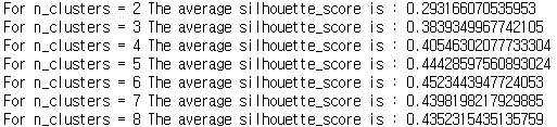
클러스터가 6일때 가장 계수가 좋게 나왔다. 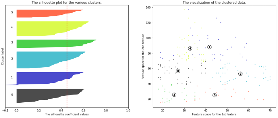
02 해석 및 적용 방안
- 각각의 데이터들이 클러스터를 통해 클러스터 어디에 속할지 번호를 부여받았다.
- 이제 이것들은 DF열에 따로 추가해서 어떤 고객이 어떤 클러스터들을 가지고 있는지 구분 지은 후 다시 특성을 파악 해야 한다.
# 기존 데이터 셋에 각 고객이 속한 클러스터 값을 넣은 후 특성 확인
df['cluster'] = cluster_labels
df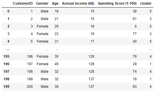
df.groupby('cluster')['Age'].mean()
cluster
0    27.000000
1    41.685714
2    56.155556
3    25.272727
4    32.692308
5    44.142857

sns.boxplot(x='cluster',y='Age',hue='Gender',palette=['c','m'], data=df);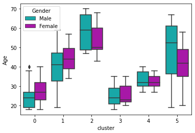
- 군집별로 나이 평균을 박스 플롯으로 표현 했다.
- 여러 그래프로 비교 해 보자
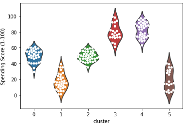
# 바이올린과 스웜플롯으로 구체적으로 시각화
ax = sns.violinplot(x='cluster', y='Annual Income (k$)', data=df, inner=None)
ax = sns.swarmplot(x='cluster', y='Annual Income (k$)', data=df, color='white', edgecolor='grey')

ax = sns.violinplot(x='cluster', y='Spending Score (1-100)', data=df, inner=None)
ax = sns.swarmplot(x='cluster', y='Spending Score (1-100)', data=df, color='white', edgecolor='grey')

ax = sns.violinplot(x='cluster', y='Age', data=df, inner=None)
ax = sns.swarmplot(x='cluster', y='Age', data=df, color='white', edgecolor='grey')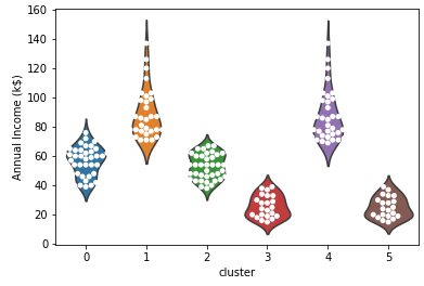
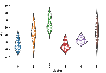
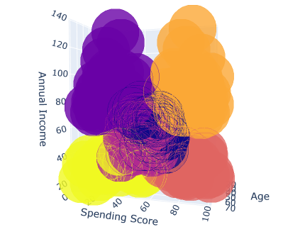
- 3차원도 있지만 3차원은 보기가 힘들다 (아래 참고)
▶ 적용 방안 논의
더보기더보기더보기# 한번에 놓고 적용 방안 논의
# 3개의 시각화를 한 화면에 배치합니다.
figure, ((ax1, ax2, ax3)) = plt.subplots(nrows=1, ncols=3)
# 시각화의 사이즈를 설정해줍니다.
figure.set_size_inches(20, 6)
# 클러스터별로 swarmplot을 시각화해봅니다.
ax1 = sns.violinplot(x="cluster", y='Annual Income (k$)', data=df, inner=None, ax=ax1)
ax1 = sns.swarmplot(x="cluster", y='Annual Income (k$)', data=df,
color="white", edgecolor="gray", ax=ax1)
ax2 = sns.violinplot(x="cluster", y='Spending Score (1-100)', data=df, inner=None, ax=ax2)
ax2 = sns.swarmplot(x="cluster", y='Spending Score (1-100)', data=df,
color="white", edgecolor="gray", ax=ax2)
ax3 = sns.violinplot(x="cluster", y='Age', data=df, inner=None, ax=ax3)
ax3 = sns.swarmplot(x="cluster", y='Age', data=df,
color="white", edgecolor="gray", ax=ax3, hue="Gender")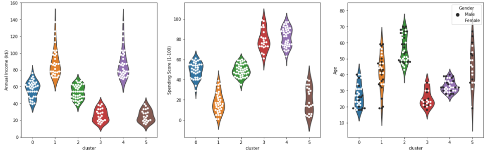
- 각 클러스터 별 특성을 아래와 같이 정리를 한 후
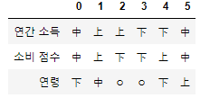
- 소비가 가장 높은 군집은 1번과 4번. 이 둘을 타겟으로 방안 마련
- 1번의 군집 특성
연간소득이 높은편, 잘 유도 하여 지출을 더 하게 만들 수 있음
1의 연령대는 20대 후반 ~ 40대 초반으로 젊은 편
1의 세부 고객 정보를 더 분석해서 타겟 마케팅을 기획 즉 고소득 젊은층이 선호할 이벤트나 사은품등을 기획 - 4번 군집
연간 소득은 낮지만 우리 쇼핑몰에서 소비점수는 높은 편
특히 우리 쇼핑몰에 대한 충성도가 높고 구매 비율이 높은 고객군으로 추정
가격적인 혜택을 추가 제공하는것을 고려(할인 쿠폰, 멤버십 등) - 잠재 VIP 고객 - 2번: 연간소득은 높지만 소비점수가 낮은 케이스
우리 쇼핑몰에서 소비를 더 할 수 있는 고객 층
연령은 전 연령대에 걸쳐 있고 다른 변수들을 넣어 잠재성과 고객의 방문, 구매를 유도해볼필요가 있음
재 방문시 사은품 증정, 특정 금액 이상 구매시 혜택 제공 등 재 방문과 구매를 유도 할 수 있음
♣ Revenue 예제 2
01 문제 정의
- 이익을 극대화하는 또 하나의 예제 '통신사 고객 데이터'를 가지고 연습해보자.
https://www.kaggle.com/blastchar/telco-customer-churn -> 파일 다운 가능* 기본 세팅
import pandas as pd
import numpy as np
import matplotlib.pyplot as plt
import seaborn as sns
from sklearn.cluster import KMeans

df = pd.read_csv('WA_Fn-UseC_-Telco-Customer-Churn.csv')
df.head()

df.shape
(7043, 21)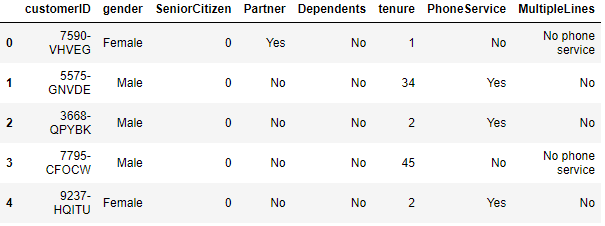
* 각 콜럼 설명
- 해지 여부
- Churn - 고객이 지난 1개월 동안 해지했는지 여부 (Yes or No)
- Demographic 정보
- customerID - 고객들에게 배정된 유니크한 고객 번호 입니다.
- gender - 고객의 성별 입니다(male or a female).
- Age - 고객의 나이 입니다.
- SeniorCitizen - 고객이 senior 시민인지 여부(1, 0).
- Partner - 고객이 파트너가 있는지 여부(Yes, No).
- Dependents - 고객이 dependents가 있는지 여부(Yes, No).
- 고객의 계정 정보
- tenure - 고객이 자사 서비스를 사용한 개월 수.
- Contract - 고객의 계약 기간 (Month-to-month, One year, Two year)
- PaperlessBilling - 고객이 paperless billing를 사용하는지 여부 (Yes, No)
- PaymentMethod - 고객의 지불 방법 (Electronic check, Mailed check, Bank transfer (automatic), Credit card (automatic))
- MonthlyCharges - 고객에게 매월 청구되는 금액
- TotalCharges - 고객에게 총 청구된 금액
- 고객이 가입한 서비스
- PhoneService - 고객이 전화 서비스를 사용하는지 여부(Yes, No).
- MultipleLines - 고객이 multiple line을 사용하는지 여부(Yes, No, No phone service).
- InternetService - 고객의 인터넷 서비스 사업자 (DSL, Fiber optic, No).
- OnlineSecurity - 고객이 online security 서비스를 사용하는지 여부 (Yes, No, No internet service)
- OnlineBackup - 고객이 online backup을 사용하는지 여부 (Yes, No, No internet service)
- DeviceProtection - 고객이 device protection에 가입했는지 여부 (Yes, No, No internet service)
- TechSupport 고객이 tech support를 받고있는지 여부 (Yes, No, No internet service)
- StreamingTV - 고객이 streaming TV 서비스를 사용하는지 여부 (Yes, No, No internet service)
- StreamingMovies - 고객이 streaming movies 서비스를 사용하는지 여부 (Yes, No, No internet service)
▶ 문제 정의
- 대부분 데이터가 범주형으로 되어 있다
- 통신사의 고객 데이터에서 CLV를 계산하여 고객의 CHURN-해지여부를 예측을 해 볼 예정
- CLV(Customer Lifetime Value)로 고객 생애 가치로 불리는데 고객이 우리 서비스를 이요하는 총 기간 내에 얼마만큼 이익을 주는가를 돈으로 계산한것.
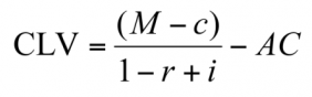
- M - 고객 1 인당 평균 매출. 보통 1년 단위로 계산
c - 고객 1인당 평균 비용. 보통 1년 단위로 계산
r - 고객 유지 비율(Retention rate). 즉 어떤 고객이 그 다음 해에도 여전히 고객으로 남아 있을 확률
i - 이자율 또는 할인율
AC - 고객 획득 비용(Acquisition Cost). 고객이 첫 방문 또는 첫 구매를 하도록 하는데 드는 비용
참조 링크 (https://brunch.co.kr/@yhsonb0r/2)
02 EDA
# 데이터 확인 df.shape (7043, 21) # 결측치 df.isnull().sum() customerID 0 gender 0 SeniorCitizen 0 Partner 0 Dependents 0 tenure 0 PhoneService 0 MultipleLines 0 InternetService 0 OnlineSecurity 0 OnlineBackup 0 DeviceProtection 0 TechSupport 0 StreamingTV 0 StreamingMovies 0 Contract 0 PaperlessBilling 0 PaymentMethod 0 MonthlyCharges 0 TotalCharges 0 Churn 0 df.info() # Column Non-Null Count Dtype --- ------ -------------- ----- 0 customerID 7043 non-null object 1 gender 7043 non-null object 2 SeniorCitizen 7043 non-null int64 3 Partner 7043 non-null object 4 Dependents 7043 non-null object 5 tenure 7043 non-null int64 6 PhoneService 7043 non-null object 7 MultipleLines 7043 non-null object 8 InternetService 7043 non-null object 9 OnlineSecurity 7043 non-null object 10 OnlineBackup 7043 non-null object 11 DeviceProtection 7043 non-null object 12 TechSupport 7043 non-null object 13 StreamingTV 7043 non-null object 14 StreamingMovies 7043 non-null object 15 Contract 7043 non-null object 16 PaperlessBilling 7043 non-null object 17 PaymentMethod 7043 non-null object 18 MonthlyCharges 7043 non-null float64 19 TotalCharges 7043 non-null object 20 Churn 7043 non-null object- 대부분의 위에서 언급했던것처럼 범주형으로 되어 있다.
- 거기다 나머지 범주형은 이해가 가는데 'TotalCharges'가 범주형인게 이상하다 확인 후 변경 해 주자
df['TotalCharges'] 0 29.85 1 1889.5 2 108.15 3 1840.75 4 151.65 ... 7038 1990.5 7039 7362.9 7040 346.45 7041 306.6 7042 6844.5- 숫자인데도 object형이다. 'MonthlyCharges'와 같은 형태로 바꿔 주자
pd.to_numeric(df['TotalCharges']) ValueError: Unable to parse string " " at position 488- 빈값때문에 오브젝트형으로 맞춰진거같다. 빈값을 제거하고 바꿔 주자
df[df['TotalCharges'] == " "]- 이렇게 확인을 해보면 'TotalCharges' 가 공백인 데이터의 'tenure'(고객이 자사제품을 사용한 개월 수)를 보면 0으로 나오는데 이 뜻은 가입한지 아직 한달도 안된 고객이라고 유추가 된다. 즉 아직 한달도 사용을 안했으니 매달 요금도 안나간것으로 간주 된다.
- 이 빈값을 'NaN'로 처리하자
# 빈캅 nan으로 처리
df['TotalCharges'] = df['TotalCharges'].replace(' ', np.nan)

df[df['tenure'] == 0]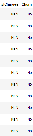
- 사실 널값이 아닌 빈공백의 데이터가 11개밖에 되지 않아서 버려도 된다. 이를 버리고 나머지 데이터들의 형태를 바꿔주도록 하자
# 널값들은 버리고 나머지 형태 바꾸기
df = df[df['TotalCharges'].notnull()]

# 데이터 형태 바꾸기
df['TotalCharges'] = df['TotalCharges'].astype(float)
print(df.shape)
print(df.info())

(7032, 21)
 #   Column            Non-Null Count  Dtype
---  ------            --------------  -----
 0   customerID        7032 non-null   object
 1   gender            7032 non-null   object
 2   SeniorCitizen     7032 non-null   int64
 3   Partner           7032 non-null   object
 4   Dependents        7032 non-null   object
 5   tenure            7032 non-null   int64
 6   PhoneService      7032 non-null   object
 7   MultipleLines     7032 non-null   object
 8   InternetService   7032 non-null   object
 9   OnlineSecurity    7032 non-null   object
 10  OnlineBackup      7032 non-null   object
 11  DeviceProtection  7032 non-null   object
 12  TechSupport       7032 non-null   object
 13  StreamingTV       7032 non-null   object
 14  StreamingMovies   7032 non-null   object
 15  Contract          7032 non-null   object
 16  PaperlessBilling  7032 non-null   object
 17  PaymentMethod     7032 non-null   object
 18  MonthlyCharges    7032 non-null   float64
 19  TotalCharges      7032 non-null   float64
 20  Churn             7032 non-null   object
df.describe()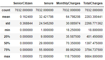
# 변수간 corr 확인
df.corr()

# 시각화
corr = df.corr()
sns.heatmap(corr, annot=True);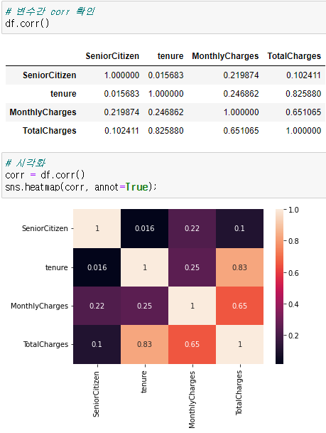
- 사용개월수와 차지들간의 관계가 보인다
- 해지고객의 분포도 보자
# 해지고객 분포
sns.countplot(y='Churn', data=df);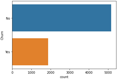
# 변수들간의 pairplot
sns.pairplot(df, hue='Churn');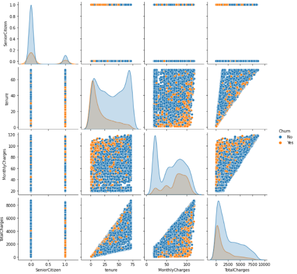
- tenure(자사 사용 개월수)가 낮은 경우 churn(해지여부)가 높음. 즉 최근 고객들이 해지를 많이 함
- 어느정도 이상의 tenure이 되면 충성고객이 되어 churn이 낮게 나옴
- MonthlyChares가 높을 경우 churn도 높음
- tenure와 MonthlyChrages가 주요 변수로 보임
- pairplot으로 볼 수 있는 변수들은 한계가 있음. 범주형도 처리를해서 다같이 보도록 하자
# 카테고리 변수의 카테고리가 어떻게 구성되어 있는지 확인 합니다.
print(df['gender'].value_counts())
print("=================================")
print(df['Partner'].value_counts())
print("=================================")
print(df['Dependents'].value_counts())
print("=================================")
print(df['PhoneService'].value_counts())
print("=================================")
print(df['MultipleLines'].value_counts())
print("=================================")
print(df['InternetService'].value_counts())
print("=================================")
print(df['OnlineSecurity'].value_counts())
print("=================================")
print(df['OnlineBackup'].value_counts())
print("=================================")
print(df['DeviceProtection'].value_counts())
print("=================================")
print(df['TechSupport'].value_counts())
print("=================================")
print(df['StreamingTV'].value_counts())
print("=================================")
print(df['StreamingMovies'].value_counts())
print("=================================")
print(df['Contract'].value_counts())
print("=================================")
print(df['PaperlessBilling'].value_counts())
print("=================================")
print(df['PaymentMethod'].value_counts())
print("=================================")
print(df['Churn'].value_counts())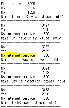
'No internet service' 를 No로 처리 해도 될듯 # 다음 컬럼들에 대해 'No internet service'를 'No'로 변환해줍니다. replace_cols = ['MultipleLines', 'OnlineSecurity', 'OnlineBackup', 'DeviceProtection','TechSupport','StreamingTV', 'StreamingMovies'] for i in replace_cols : df[i] = df[i].replace({'No internet service' : 'No'})'빅데이터 > Data-Analysis' 카테고리의 다른 글
실전 예제 - 마케팅 데이터 분석 06 (Referral) (0) 2022.02.25 실전 예제 - 마케팅 데이터 분석 05 (Revenue - 03) (0) 2022.02.24 실전 예제 - 마케팅 데이터 분석 03 (Revenue) (0) 2022.02.24 실전 예제 - 마케팅 데이터 분석 02 (Activation/Retention) (0) 2022.02.23 실전 예제 - 마케팅 데이터 분석 01 (Acquisition) (0) 2022.02.21