-
실전 예제 - 온-오프라인 비지니스 분석 11빅데이터/Data-Analysis 2022. 3. 2. 19:56
패스트캠퍼스 '직장인을 위한 파이썬 데이터분석 올인원 패키치 Online' 참조
01 월별 매출액
# for문을 이용해서 날짜데이터를 string으로 변환후 원하는 포맷으로 출력하기

# # row가 많아 시간이 조금 걸릴 수 있습니다.
# # date.strftime(format) : 지정된 포맷에 맞춰 date 객체의 정보를 문자열로 반환합니다.

for i in range(len(df_clean)):

    # i번째 'date'칼럼에 원하는 값 지정
    date = df_clean['order_approved_at'][i].strftime('%Y%m')
    df_clean.loc[ i, 'order_date'] = date


# apply lambda를 이용해서 날짜데이터를 string으로 변환후 원하는 포맷으로 출력하기

df_clean['order_date'] = df_clean['order_approved_at'].apply(lambda x : x.strftime('%Y%m') )
df_clean['order_date']

0        201710
1        201807
2        201808
3        201711
4        201802
          ...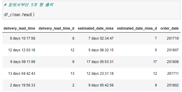
# pivot_table을 통해 상품카테고리들의 연월별 평균 매출액 출력 df_order_pivot = df_order_tmp.pivot_table( values='order_amount', index='product_category_name_english', columns='order_date', aggfunc='mean') df_order_pivot- 2016~2018년 까지 전체 매출이 가장 높은 'health_beauty' 카테고리 월별 변화량 시각화
# health_beauty 카테고리의 연월별 평균 매출액 출력
df_order_pivot.loc["health_beauty",:]
order_date
201609   134.97
201610    91.82
201612      nan
201701   147.45
201702   154.94
201703   131.73
...

# 연월별 평균매출액 출력
# null값은 제외

df_health_beauty = pd.DataFrame(df_order_pivot.loc["health_beauty",:])
df_health_beauty = df_health_beauty.reset_index()
df_health_beauty.columns = ['date', 'health_beauty_amount']
df_health_beauty.dropna(inplace=True)
df_health_beauty

# 막대그래프로 시각화

plt.figure(figsize=(12,8))
sns.barplot(data = df_health_beauty,
                 x='date',
                 y="health_beauty_amount",
                 palette="Blues_d"
                )
# ax.set_xticklabels(ax.get_xticklabels(),rotation=30)
plt.xticks(fontsize=14, rotation=30)
plt.show()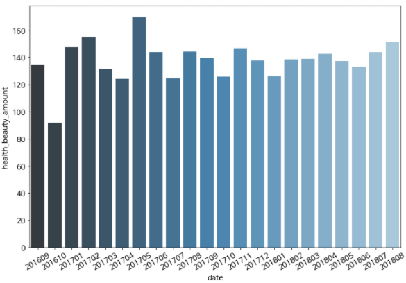
▶ 추이를 보기에는 꺾은선 그래프가 낫다
# lineplot으로 시각화

plt.figure(figsize=(12,8))
ax = sns.lineplot(data = df_health_beauty,
                 x='date',
                 y="health_beauty_amount",
                 palette="Blues_d"
                )
ax.set_xticklabels(ax.get_xticklabels(),rotation=30)
plt.show()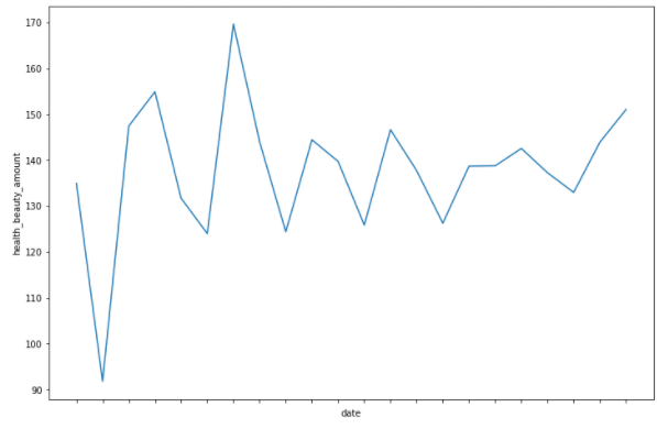
02 결제 방법 분석
df_order_pay = pd.read_csv('olist_order_payments_dataset.csv')
# 데이터 정보
df_order_pay.info()
#   Column                Non-Null Count   Dtype
---  ------                --------------   -----
 0   order_id              103886 non-null  object
 1   payment_sequential    103886 non-null  int64
 2   payment_type          103886 non-null  object
 3   payment_installments  103886 non-null  int64
 4   payment_value         103886 non-null  float64

 # 결측치
df_order_pay.isnull().sum()
order_id                0
payment_sequential      0
payment_type            0
payment_installments    0
payment_value           0
# payment_sequential이 최대값인 order_id 확인 df_order_pay[df_order_pay['payment_sequential']==df_order_pay['payment_sequential'].max()]
- 데이터스키마에는 payment_sequential 칼럼은 "지불 방법의 종류"라고 설명되어 있다. 위의 결과를 보면 동일한 주문번호 내 payment_type이 voucher로, payment_sequential이 다르게 부여된 것으로 볼 때, 이 주문은 각기 다른 바우처(=상품권)를 사용된 것으로 예상해볼 수 있다.
# 결제 방법 별 수 확인

df_order_pay['payment_type'].value_counts()
credit_card    76795
boleto         19784
voucher         5775
debit_card      1529
not_defined        3

# 결제방법이 신용카드인 경우 확인

df_credit = df_order_pay[df_order_pay['payment_type']=='credit_card']
df_credit

# 요약 정보 확인

df_credit.describe()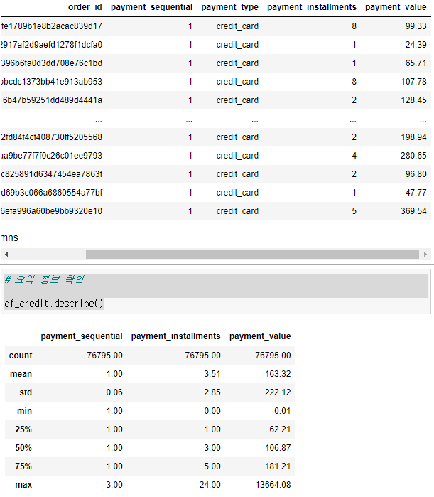
신용카드를 쓸 경우 평균 3.5번 정도 나눠서 지불하고 최대 24개월 할부를 한다고 볼 수 있다 # 결제 방법 별 payment_installments 평균값 확인 df_order_pay.groupby(['payment_type'])['payment_installments'].mean() boleto 1.00 credit_card 3.51 debit_card 1.00 not_defined 1.00 voucher 1.00 # 고객들이 많이 선택한 결제 방법과 그 수 df_order_pay['payment_type'].value_counts() credit_card 76795 boleto 19784 voucher 5775 debit_card 1529 not_defined 3 # 고객들이 많이 선택한 결제 방법 별 비율 df_order_pay['payment_type'].value_counts(normalize=True)*100 # 퍼센트 credit_card 73.92 boleto 19.04 voucher 5.56 debit_card 1.47 not_defined 0.00- 이 결제 방식을 시각화!
# pie 그래프

temp = pd.DataFrame(df_order_pay['payment_type'].value_counts(normalize=True)*100)
temp = temp[temp.index != 'not_defined'] # 너무 작은 수라 제외함

labels = temp.index
sizes = temp['payment_type']

explode = (0.1, 0, 0, 0.1)

plt.pie(
        sizes,
        labels=labels,
        explode=explode,
        autopct='%1.2f%%', # second decimal place
        shadow=True,
        startangle=50,
        textprops={'fontsize': 14} # text font size
        )

plt.axis('equal') #  equal length of X and Y axis
plt.title('결제방식의 종류별 비율', fontsize=20)
plt.show()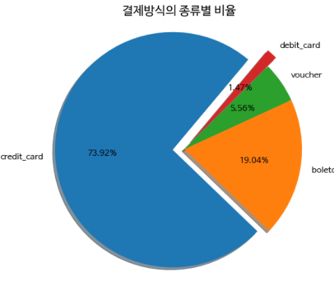
03 리뷰 분포
df_order_review = pd.read_csv('olist_order_reviews_dataset.csv') df_order_review['review_creation_date'] = pd.to_datetime(df_order_review['review_creation_date']) df_order_review['review_answer_timestamp'] = pd.to_datetime(df_order_review['review_answer_timestamp']) df_order_review.info() Data columns (total 7 columns): # Column Non-Null Count Dtype --- ------ -------------- ----- 0 review_id 99224 non-null object 1 order_id 99224 non-null object 2 review_score 99224 non-null int64 3 review_comment_title 11568 non-null object 4 review_comment_message 40977 non-null object 5 review_creation_date 99224 non-null datetime64[ns] 6 review_answer_timestamp 99224 non-null datetime64[ns] # 결측치 df_order_review.isnull().sum() review_id 0 order_id 0 review_score 0 review_comment_title 87656 review_comment_message 58247 review_creation_date 0 review_answer_timestamp 0- 제목과 메세지에 결측치가 많은데 리뷰를 별점만주고 따로 작성은 하지 않는다고 유출 해 볼 수 있다
- 'review_creation_date'는 고객만족도조사 설문지가 고객에게 보내진 날짜를 의미
- 'review_answer_timestamp'는 고객이 설문조사에 응답한 날짜를 의미
# 요약 정보 확인

df_order_review.describe()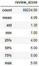
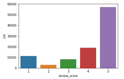
# 리뷰 점수 별 수

df_review = pd.DataFrame(df_order_review['review_score'].value_counts())
df_review.reset_index(inplace=True)
df_review.columns = ['review_score', 'cnt']
df_review

# 막대그래프 시각화

sns.barplot(data = df_review,
           x = 'review_score',
           y = 'cnt')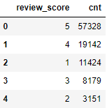
# review_score 별 비율

df_order_review['review_score'].value_counts(normalize=True)*100
5   57.78
4   19.29
1   11.51
3    8.24
2    3.18

# review_score 별 비율 시각화 : piechart

temp = pd.DataFrame(df_order_review['review_score'].value_counts(normalize=True)*100)

labels = temp.index
sizes = temp['review_score']

explode = (0.1, 0, 0, 0, 0)

plt.pie(
        sizes,
        labels=labels,
        explode=explode,
        autopct='%1.2f%%', # second decimal place
        shadow=True,
        startangle=70,
        textprops={'fontsize': 14} # text font size
        )

plt.axis('equal') #  equal length of X and Y axis
plt.title('Review Ratio', fontsize=20)
plt.show()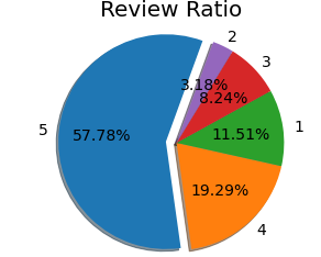
'빅데이터 > Data-Analysis' 카테고리의 다른 글
실전 예제 - 시계열 분석 13 (0) 2022.03.03 실전 예제 - 시계열 분석 12 (0) 2022.03.03 실전 예제 - 온-오프라인 비지니스 분석 10 (0) 2022.03.02 실전 예제 - 온-오프라인 비지니스 분석 09 (0) 2022.03.01 실전 예제 - 코로나 데이터 분석 08 (0) 2022.02.28