빅데이터/Data-Analysis
인구 통계 분석 - 위키피디아 크롤링 및 데이터 분석 01
H-V
2022. 3. 4. 16:37
유투버 'todaycode오늘코드'님 강의 참조
- 위키피디아의 인구관련 페이지를 크롤링하고 그 데이터를 가지고 분석을 할 예정
01 크롤링
- 직접 크롤링을 돌려도 되나 판다스를 이용해서 더욱 더 편리하게 가능 하다.
import pandas as pd
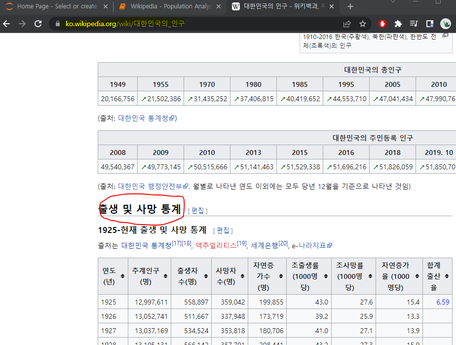
url ='https://ko.wikipedia.org/wiki/%EB%8C%80%ED%95%9C%EB%AF%BC%EA%B5%AD%EC%9D%98_%EC%9D%B8%EA%B5%AC'
pd.read_html(url)
# 테이블 화
table = pd.read_html(url)
len(table)
# 리스트형태인 테이블을 인덱싱으로 각각 불러와진다
table[4]
df = table[4]
df.shape
(97, 9)

df.head()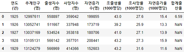
02 시각화 및 분석
- 몇개의 컬럼들을 시각화 해보자
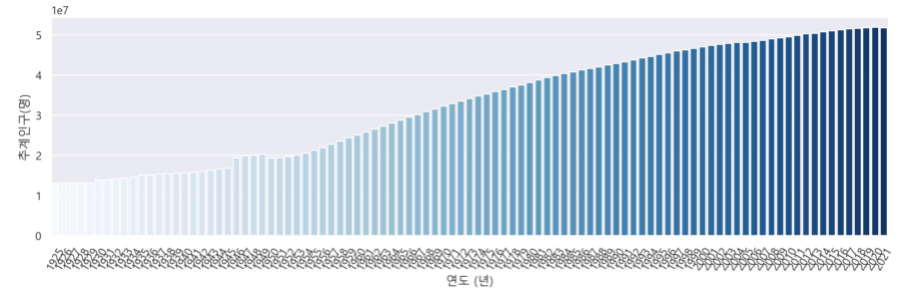
▶ 추계인구
# 시각화
import seaborn as sns
import matplotlib.pyplot as plt
from IPython.display import set_matplotlib_formats
set_matplotlib_formats('retina')


# MAC = 'AppleGothic'
plt.figure(figsize=(15,4))
plt.xticks(rotation=90)
sns.set(font='Malgun Gothic')
sns.pointplot(data=df, x='연도 (년)', y='추계인구(명)')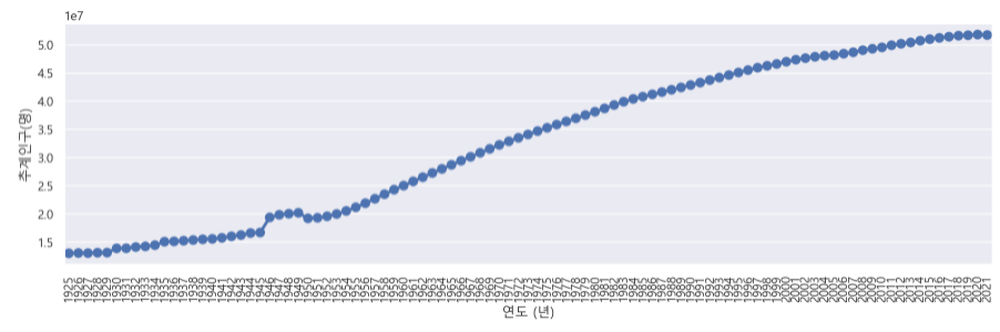
plt.figure(figsize=(15,4))
plt.xticks(rotation=60)
sns.lineplot(data=df, x='연도 (년)', y='추계인구(명)')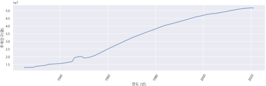
- 인구수는 끊임없이 증가한것을 볼 수 있다
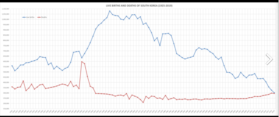
▶ 출생자 수
plt.figure(figsize=(15,4))
plt.xticks(rotation=60)
sns.pointplot(data=df, x='연도 (년)', y='출생자수(명)')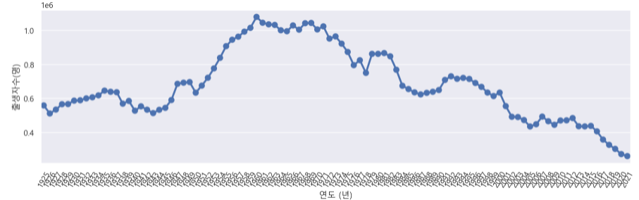
*1e6 은 10의 6승이라는 말 -> (10 ** 6) * 0.4 를하면 얼마나 뜻하는지 알 수 있음
▶ 사망자 수
plt.figure(figsize=(15,4))
plt.xticks(rotation=60)
sns.lineplot(data=df, x='연도 (년)', y='사망자수(명)')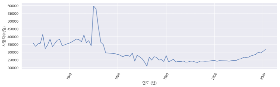
03 위키피디아 그래프 만들기
plt.figure(figsize=(15,8))
plt.xticks(rotation=60)

sns.pointplot(data=df, x='연도 (년)', y='출생자수(명)')
sns.pointplot(data=df, x='연도 (년)', y='사망자수(명)', color='orange')
plt.ylabel('인구수(명)')
▶ 판다스로 그래프 그리기
# 판다스로 그래프 그리기
# 1. 원하는 컬럼만 추출
df_pop = df[['연도 (년)', '출생자수(명)', '사망자수(명)']]

# 2. 그래프 축을 위한 인덱스 수정
df_pop = df_pop.set_index('연도 (년)')

# 3. 시각화
df_pop.plot(figsize=(15,4))

# SEABORN도 슬라이싱 가능
plt.figure(figsize=(15,8))
plt.xticks(rotation=60)

sns.pointplot(data=df[-50:], x='연도 (년)', y='출생자수(명)')
sns.pointplot(data=df[-50:], x='연도 (년)', y='사망자수(명)', color='orange')
plt.ylabel('인구수(명)')
▶ 최근 50년 인구수만 시각화
# 최근 50년만 시각화
df_pop[-50:].plot()
▶ 추계 인구수
# 추계 인구수
plt.figure(figsize=(15,4))
plt.xticks(rotation=60)
sns.barplot(data=df, x='연도 (년)', y='추계인구(명)', palette='Blues')